Creative direction guide · reviewed August 5, 2026
Product photography background ideas with a job to do.
Choose white, neutral, natural, colored, or contextual backgrounds based on the image role—not decoration alone.
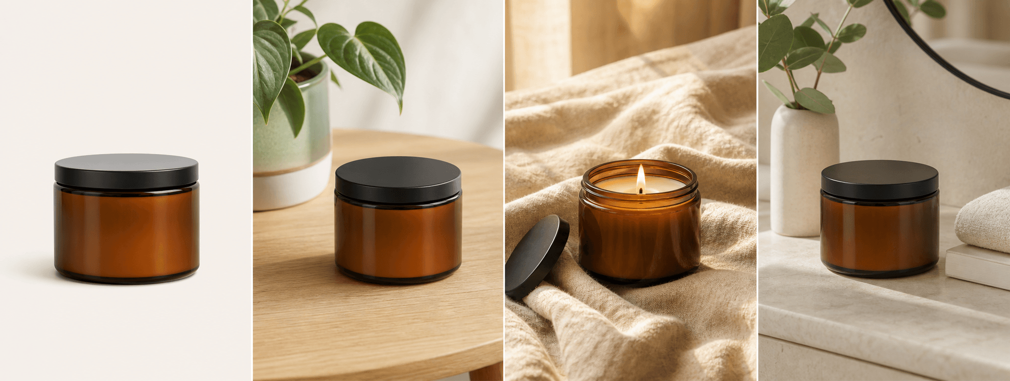
Quick answer
What background is best for product photography?
The best background depends on the image job. Use white or a very quiet neutral for fast product identification, natural texture for material and mood, contextual settings for use and scale, and controlled brand color for campaigns. The product should remain the clearest element in every case.
A complete ecommerce gallery can use several background types, but the lighting, product scale, color treatment, and overall art direction should still feel consistent. Avoid a new visual universe in every frame.
Platform rules and interfaces can change. Use the linked primary sources as the final authority, then test the result in the marketplace or storefront you actually use.
Five useful directions
Match the backdrop to the shopper question.
A catalog background answers “what is it?” A lifestyle background answers “where does it belong?” A detail scene answers “what does it feel like?” A scale scene answers “how big is it?” A gift or campaign scene answers “why now?”
Decide the question before selecting props and color. This prevents every image from becoming a generic mood shot and gives the gallery a clear sequence.
- White or light neutral for catalog clarity
- Wood, linen, stone, or paper for tactile detail
- Real rooms and workspaces for use context
- Controlled brand color for launches and campaigns
Category fit
Use surfaces that support the product category.
Skincare can suit clean stone, linen, glass, or bathroom surfaces; coffee can suit wood, ceramic, paper, and warm kitchen context; jewelry often benefits from restrained fabric, stone, or gift presentation; packaging needs clean contrast and readable labels.
These are starting points, not formulas. Check whether the surface color changes the perceived product color, whether props imply ingredients or accessories, and whether reflections hide important construction details.
- High contrast for small or intricate products
- Matte surfaces for reflective packaging
- Minimal props for label-heavy products
- Truthful contextual objects only
A coherent catalog
Create variety inside one visual system.
Choose a limited palette, repeat two or three surface families, keep lighting direction consistent, and maintain similar product scale. This creates variety without making the catalog feel assembled from unrelated shoots.
When using AI backgrounds, inspect edge quality, contact shadows, perspective, reflections, labels, and the relationship between the product and surface. A beautiful background cannot rescue a product that no longer matches the real item.
Keep a factual source photo and a clean product-first image in every channel. Lifestyle backgrounds should add context, not replace evidence.
Before you publish
Product background selection checklist
Ask these questions before you publish a background variation.
- The background has a clear role in the product gallery.
- The product remains the highest-priority visual element.
- Surface color and light do not change the perceived product color.
- Props do not imply false ingredients, accessories, quantity, or use.
- Contact shadows, scale, perspective, and reflections look physically believable.
- The scene still belongs to the same brand and catalog system as the other images.
Primary references